
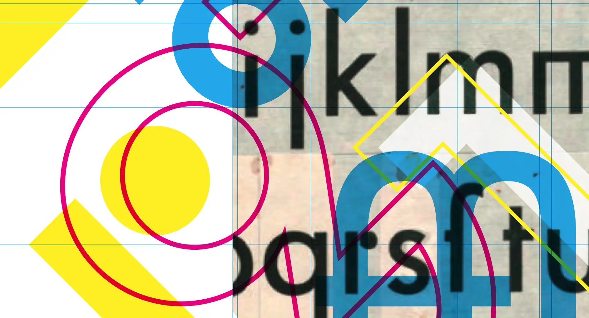
Listen, Futura, you seem pretty popular with my students even though you are a little old-fashioned. A long while ago, we had a thing, too. I thought you were the revolutionary, a forward-thinking anarchist.
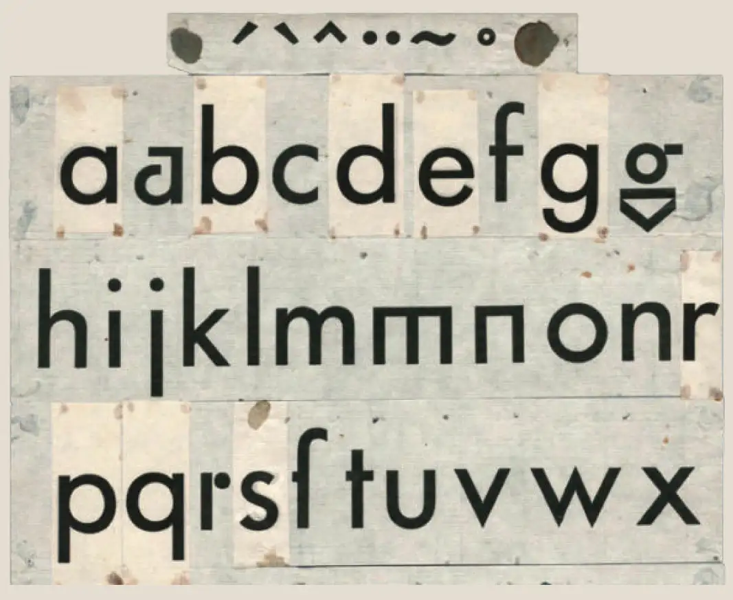
You started 1924 as a project of Paul Renner, who developed you as a contribution to the New Frankfurt Project, a new, radical, affordable housing project. Paul’s first sketches were conceived without capitals, as they are capitalistic. Since all letters sound the same, petite or statuesque, why not democratize? Everybody is the same, so progressive, so Bauhaus. That was fresh, woke, based on reason and functionality; it had that radical ideology that tried to transform the power structure into a new utopian society without wars or hierarchy. I adore that anarchist spirit. The first sketches have a fantastic ‘a’ and ‘g’ and a lowercase ‘r’ with a separated terminal—just a circle. Drool. It’s love.
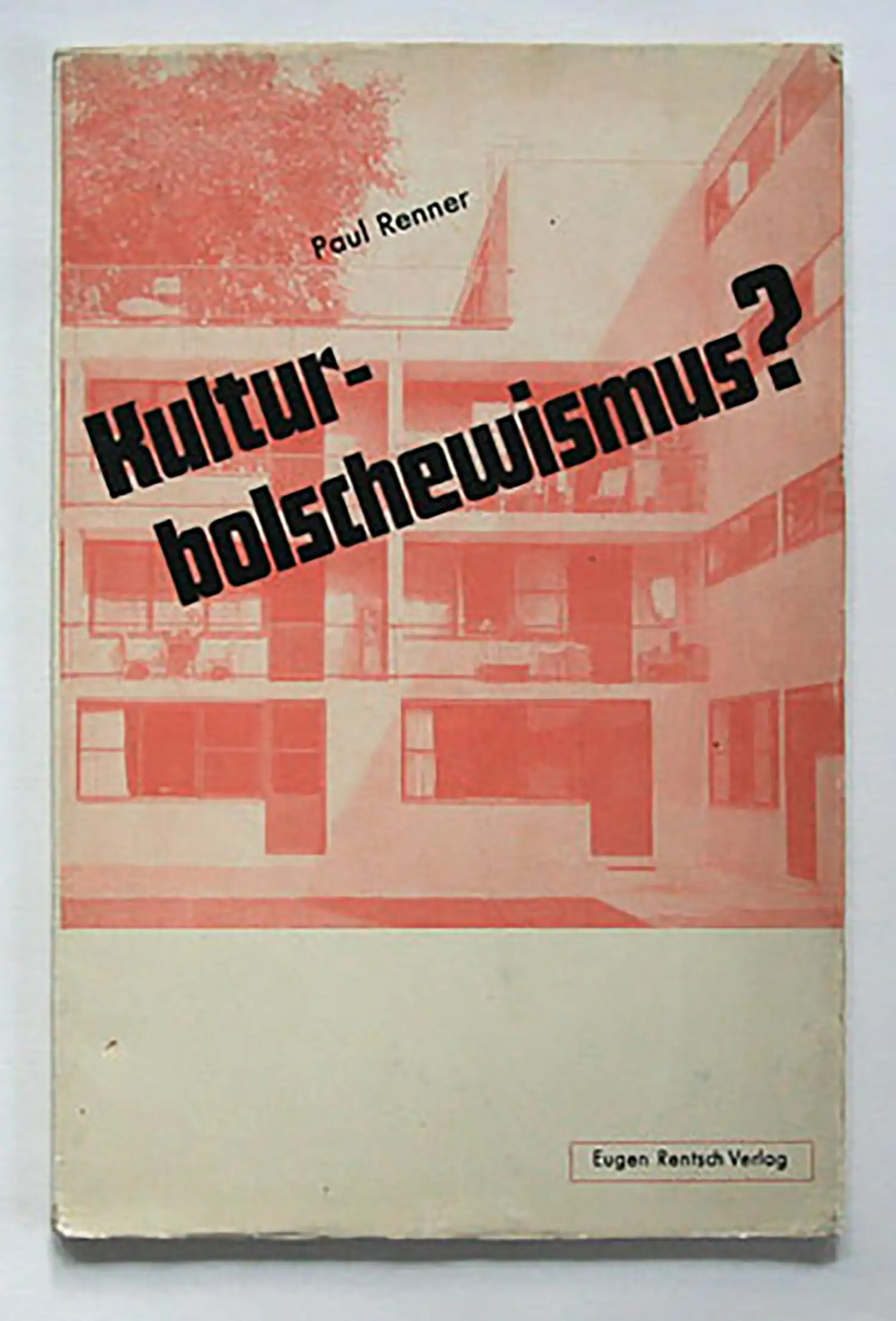
Like all liberal intellectuals during the world wars, Paul opposed the Nazis’ repressive stance against art and addressed this in his book Kulturbolschewismus? (ebay something like $1k, geesh, no US library nearby). He was arrested but could emigrate to neutral Switzerland like his friend Jan Tschichold, another great German Graphic Designer.
But Paul also made compromises, small assimilations to your glyphs. He removed the unfamiliar letter forms for readability (lame) and added all in capital letters to become commercially viable. You became marketable, turned your soul to the dark, corporate side, and became the establishment. Later additions included a puny, picket-fenced condensed font, and in other wildly extended styles. in the bold styles, you gained weight so uncontrollably that you resemble but a bloated bubblegum fiend; oh, whoops, that is the Pratt Institute logo; I might get in trouble bringing that up?
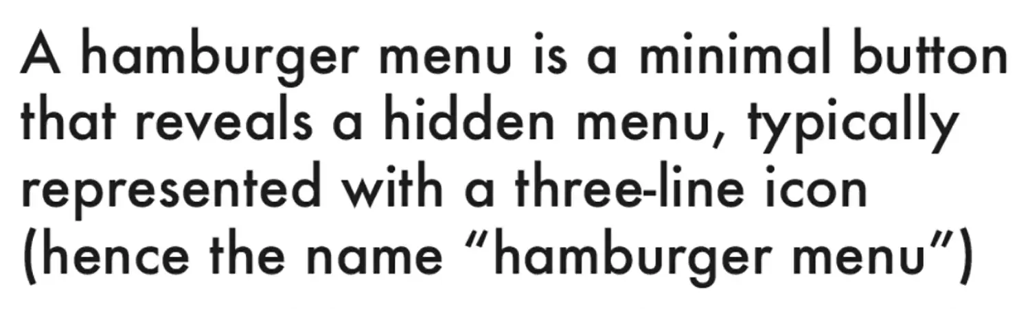
Very well, Futura, what are you? A display typeface for Bauhausian headlines? Look at the text sample below, set in Futura book. In the first line, the g in the word “hamburger” almost touches the lowercase l. As a body text, you have stretched the ascenders (b h or f) and descenders (p or q or j) up and down so far into the absurd; why are you so difficult to work with?
It’s also an uncomfortable font for people with dyslexia, even mild forms. That lowercase looks identical to the I, l, 1. The lowercase b and d, p, and q are simply flipped, which makes them uncomfortable to read. The long ascenders require very generous line spacing, which disrupts the cohesive texture that typographers usually aim for.
It breaks a design rule, the law of proximity. Things that are close to each other belong together. However, the g in “hamburger” and that lowercase “l” should thus not be that close; therefore, they subconsciously confuse, wobble, and make me seasick, and it takes a lot of work to stay on one line.
Single-story ‘a’s might be cool and modern, but they look like ‘o’s from afar. Futura’s lowercase letters have a relatively low x-height. This makes them difficult to read in small sizes and is especially problematic for digital screens, which are predominantly used today but are not friends with Futura.
Since college, I have had an ongoing crush on Adrian Frutiger’s font Avenir, which is your name in French. Not a coincidence, mon dieux! Did he have this affinity, too? Futura, I know Apollo 11 took you to the moon; congrats, who cares? I am not planning to go there anytime soon.
It’s public knowledge that Ikea broke up with you in 2009 and is now going with Mathew Carter’s Verdana. Welcome to the digital age. You are the past; swipe left; get bent; next. We have to move on and choose 21st-century fonts.